At GlobeIn, we like to start with why.
The why is what keeps our employees excited about GlobeIn: we’re here because we want to connect one billion people to the global economy and to lead by example in prioritizing people and the planet.
The why is what keeps our customers coming back: our mavens love the fact that through their purchases, they are supporting the talented artisans who make their products, all around the world.
Starting our rebranding project was no different; we began with why.
So why rebrand?
Over time our brand has gone through many iterations.
While we loved our previous logo (which was based on some of our favorite Moroccan dinner plates), we wanted to build a brand that represented our mission and who we are today.
Our mission has been the same since the very beginning, when we set out to connect amazing global entrepreneurs to a bigger market for their products.
Our Mission:
GlobeIn is a purpose-driven company growing in parallel with entrepreneurial artisan partners from around the world with the aim of enriching individuals and their communities.
We are devoted to transparent business practices, equitable and sustainable partnerships, and respect for cultural continuity. We strive to connect conscious consumers with delightful products and the talented artisans who make them, thereby strengthening the bonds of our global community.
Our new brand helps us represent this so much more by focusing on many of the things that matter most to us.
The Features of Our New Brand
Inclusive
GlobeIn was never meant to be for one type of person. We’ve always celebrated diversity through the products we feature, their unique origins, and the humans and cultures who created them. Our new brand helps celebrate the masculine and the feminine, the young and the young-at-heart, the differences, colors and shades that make life exciting. We want GlobeIn to be a brand and a product that is for everyone, without exception: where everyone can find something for themselves.
Human
We’re all human. We make mistakes. We have hopes and dreams for a better future. We crave connection and adventure. We wanted our brand to represent our humanity: GlobeIn is not a corporate company with strict policies and guidelines. We’re a bunch of humans, working together to make something that’ll put a smile on the face of other humans around the world. Even our products represent our humanity—each one is just a little bit different, because it’s been handmade by unique individuals around the world.
Tradition Meets Modernity
Our new brand helps blend the traditional with the modern. At GlobeIn, we have a love of tradition—like the traditional techniques that have been passed down from generation to generation, creating pieces of art or functional products that stand the test of time. But we also love to adapt tradition to now, creating something that feels fresh, exciting and relevant. That may be through our product development process, in collaboration with the artisan groups we work with, or on the consumer end—we love to encourage you to #GlobeInYourWay and make something traditional new through your own creativity.
Adaptable
Things change fast at GlobeIn, and we pride ourselves on being able to change when it’s necessary. We listen to feedback and collaborate with each other to bring new ideas to life. We wanted our brand to be as adaptable as we are: able to be used in multiple ways and across every platform.
Fun
GlobeIn connects consumers to items designed to bring you joy, and we wanted to represent the excitement and fun that comes along with every unboxing, through our brand.
Naming
We know there’s a lot to learn as a GlobeIn customer, and plenty of new names to remember. As we’ve rolled out new features, we’ve named each one, but they haven’t always been consistent. It was time to update our naming to keep it consistent across the brand.
We also wanted it to better represent the experience that you get from subscribing to GlobeIn. We want to take you on a journey that feels just like shopping in an international market when you visit a new place—full of excitement, discovery, and extra special finds you can’t get anywhere else.
Visual Identity
The new brand is not limited to single patterns and techniques. Structural elements like our logo, color palette, and typography keep us grounded and consistent. These core components work together to ensure our brand is recognizable wherever it appears. But we also have an expandable field for experimentation and adaptability, including patterns, illustrations, and key images.
Font Logo
The style of a font logo is a cross between sans serif and slab serif. Sans serif outlines reflect the handmade nature of our products, and the characteristic slab serif bars improve the readability of the font logo at any scale.
![]()
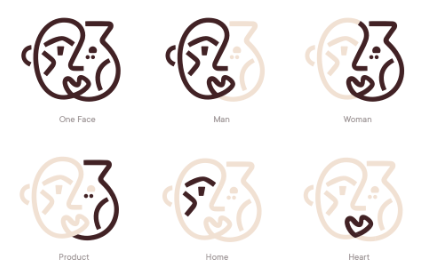
Graphic Symbol
The graphic symbol consists of several lines forming several visual images, among which are a man’s face, a woman’s face, a jug, a house, and a heart. All together they form one face. This symbol acts as a brand hero, reflecting GlobeIn’s mission and impact.
Typography
Quiza Pro is our new main header font, which represents our modern side. Osvald (Cooper Light) is used as a minor font to appeal to our more traditional roots.
Colors
We’re expanding our color palette to introduce many new colors and combinations, to better represent the diversity, inclusivity, and fun of GlobeIn.

Photography
The basic principle of our photography composition and frame is minimalism. Simplicity and taste combine with functionality, to display how our products are created and how they can be used in real life.
Pattern System
Our new graphics are a compilation of folk patterns from different countries, converted into abstract form. They create an expandable eco-system of branded illustrations, pictographs and key images for different use cases, reflecting our global nature as well as our humanity and adaptability.


We hope you love it as much as we do!
We’re so excited to share these changes with you and even more excited for what’s still to come. Keep an eye out for more updates next month!
